
Cartographies of Time
Selections from Daniel Rosenberg and Anthony Grafton’s captivating history of timelines, now in paperback—from time circles to time dragons, to a history of civilization drawn on a single piece of paper.
The images and captions here are from Cartographies of Time: A History of the Timeline by Daniel Rosenberg and Anthony Grafton and published by Princeton Architectural Press.
All images used with permission, © copyright the artist, all rights reserved.
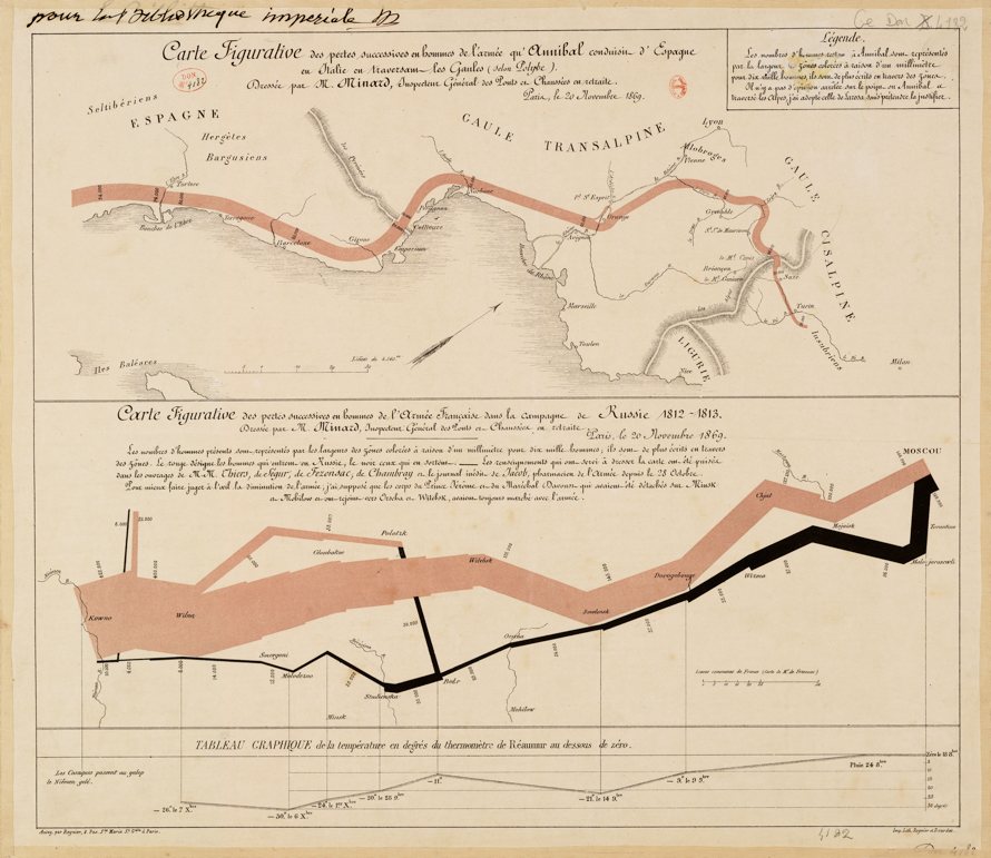
In the 1860s, the French engineer Charles Joseph Minard devised a number of new and influential infographic techniques. Among the most famous of his charts from this period is the 1869 Carte figurative des pertes successives en hommes de l’armée française dans la campagne de Russie 1812–1813 comparées à celle d’Hannibal durant la 2ème Guerre Punique. The two diagrams, published together, show the size and attrition of the armies of Hannibal in his expedition across the Alps during the Punic wars and of Napoleon during his assault on Russia. The colored band in the diagrams indicates the army’s strength of numbers—in both charts, one millimeter in thickness represents ten thousand men. The chart of Napoleon’s march includes an indication of temperature as well.
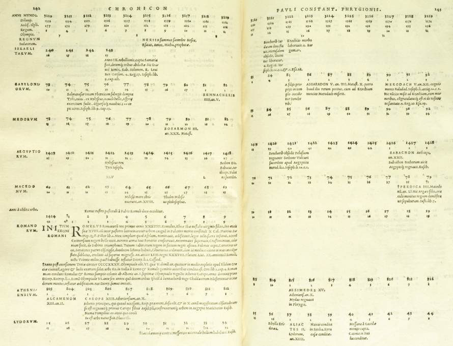
In this strikingly handsome book, published in 1534, Paulus Constantinus Phrygio lays out human history on a horizontal line. Though Phrygio’s work expresses the forward movement of history, the relatively weak axis of years along the top of the page makes the actual dates of events hard to follow. Even such turning points as the Crucifixion and the fall of Jerusalem, seen in the last image, are hard to locate. These defects of layout may explain why Phrygio’s work was not reprinted. But its content may also have played a part. His lists of early dynasties come from the texts forged by Annius of Viterbo, and his work was received with skepticism by more learned scholars.
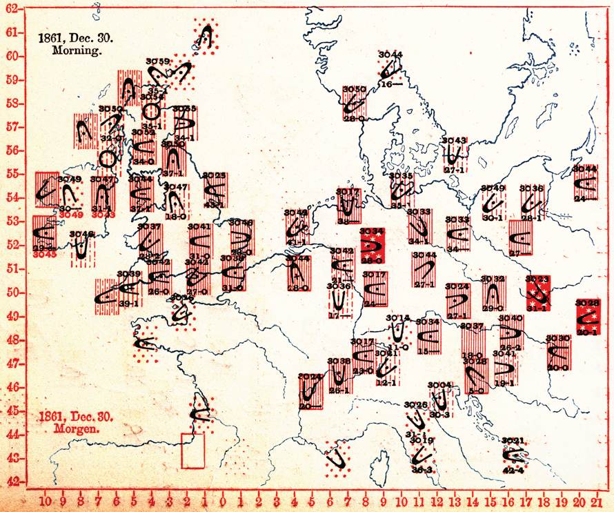
Francis Galton did pioneering work both in the study of weather and in its mapping. In Meteorographica, or Methods of Mapping the Weather, from 1863, Galton presented a variety of meteorological diagrams including “synchronous charts” such as the one depicted here, indicating weather conditions, barometric pressure, and wind direction at a single historic moment across the geographic space of Europe.
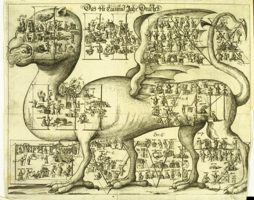
In Johannes Buno’s 1672 universal history, each millennium before the birth of Christ is figured by a large allegorical image such as the dragon of the fourth millennium depicted here.
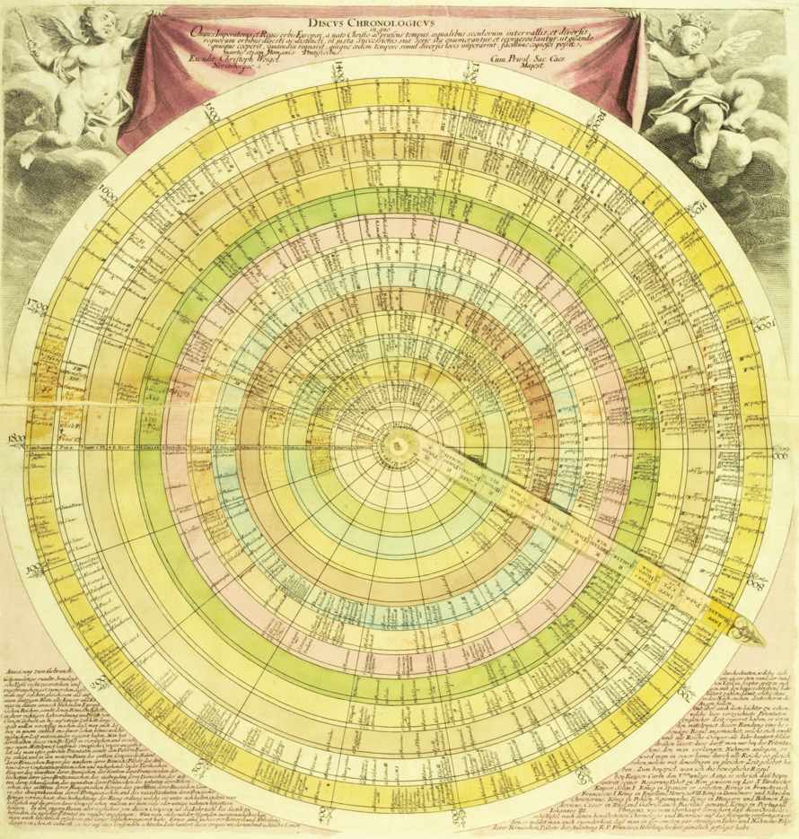
The aptly named Discus chronologicus published in the early 1720s by the German engraver Christoph Weigel is a volvelle, a paper chart with a pivoting central arm. The basic organization of data is inherited from Eusebius, but here the layout is circular with rings representing kingdoms and radial wedges representing centuries. The names of kingdoms are printed on the moveable arm. On this Princeton University copy a reader has inscribed events from contemporary history in the blank spaces of the eighteenth-century wedge, at one point carrying over into the contiguous space of the first century CE.