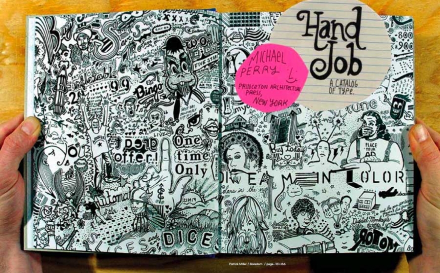
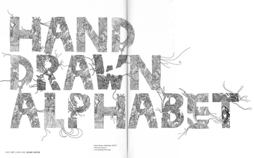
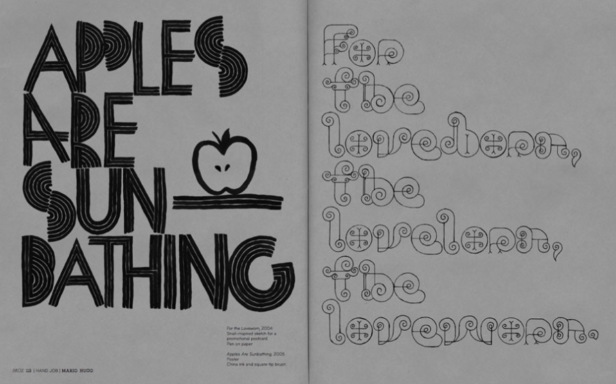
The composition of everyday things is up for review. Each week we find out new things about genes, about molecular structures—so why not the letters we read on signs, in magazines, on the flipside of our hovering skateboards? Michael Perry’s new book, Hand Job pulls together 50 examples of contemporary hand-drawn typography for a glance at how designers are using pen and ink to create new written forms.
Michael Perry is a graphic designer and typographer who has created hand-drawn type for such clients as Urban Outfitters, MTV, Rome Snowboards, Brooklyn Industries, and Polyvinyl Records. All images courtesy Michael Perry and Princeton Architectural Press; all images copyright © Michael Perry, all rights reserved.
For those in the audience who aren’t too familiar with graphic design, never mind typography, can you give us an idea what’s going through the designer’s mind when she is trying to draw an entirely new alphabet?
I must say that I cannot speak for classical typographers with this answer. For me, I think about the word as much as I do the individual letter. But when it comes to an entire face I really just like the challenge of articulating each character. What it takes to draw the letter “L” is different than the “Q.”
Once I started thinking about typography I started looking at every letterform and analyzing it. There is a huge tradition of dissecting a form and trying to rebuild it; every person with literacy on their side does this everyday. It is an art that everyone practices each and every time they write their name.
Typography is a utilitarian trade. How much of a jump is it to call some hand-drawn examples art?
I would argue that a lot of it is art. Everything featured in this book is art in my eyes. I think the art can be in the letterform, the idea, or the message.
There seems to have been an elevation of graphic design’s prestige in recent times, yet I find that, as with artists, designers nowadays tend to be less crafty, are less likely to be able to draw well (outside of Adobe software products). Does the same hold true for typographers?
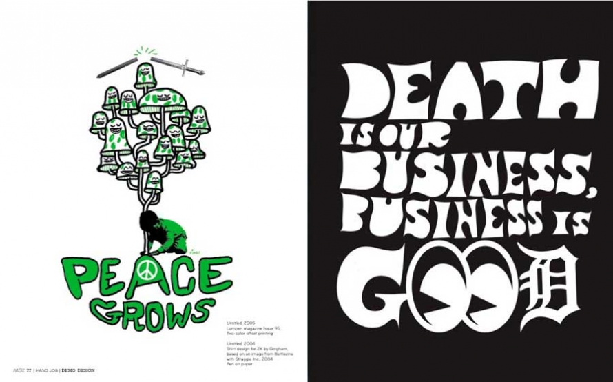
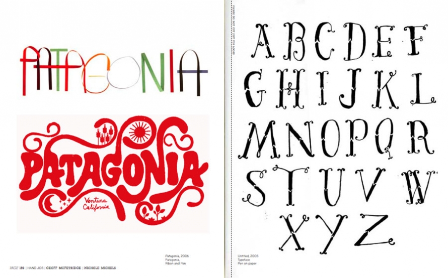
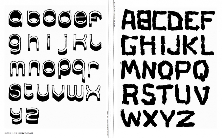
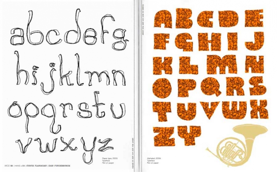
I can see how you might look at the design world and think that these people do not know how to draw. But there is a large segment in that world full of very skilled artisans. This book features 55 of them. These typographers are creating letterforms using traditional materials like watercolors, or chalk and paint, or more experimental materials like leaves fallen from a tree. The craft is an important aspect of typography, but so is process and concept just as it would be for any other “artist.”
Is there any particular font you think would be improved were it hand drawn? Any particular magazine cover?
I think a watercolor version of Adobe Garamond would be beautiful. I would love to see a handful of newspaper logos hand-drawn. Black letters always look great done by hand.
What happens when you put 50 typographers in a room?
Well, my girlfriend is not a designer and I have put her in that position multiple times. She just sits back and laughs at how everyone instantly turns into mega nerds. The first time that happened she couldn’t believe that people could talk about type for such a long time. Thankfully she loves that I am so into it!